

Timeline & Status
3 weeks
My Role
Research, UX design, Cross-team collaboration
Tools
Figma, Sketch, Adobe Photoshop, Google Survey
introduction
The Geisel library offers a variety of general technology accessories, media equipments, and toolkits, etc. for students at University of California, San Diego. Students can go to the main front desk and the Media Desk to check out these items with their student ID during regular hours. However, many students are unaware of the Tech Lending Program that Geisel Library offers. Furthermore, students are unable to check out items after hours at around 12am, as most library desk staff will be gone.
Project Impact
We aim to raise awareness on the Tech Lending Program currently available at the UCSD Geisel Library, and make its equipment more accessible to UCSD students by creating a frictionless process for checking out equipment, during and after working hours.
research
Identifying Current Issues
The website for the Tech Lending Program does not offer a way to reserve items online. The system to check the availability of items required user’s prior knowledge and hard to use.
Field Observations
We discovered a multitude of posters advertising the various resources of the library, yet students walk by these without giving them a second glance.This seemed like a great opportunity of providing awareness and exposure of these resources to students


Survey Highlights
Did you know about the Tech Lending Program at Geisel?

How often do you have to borrow something at the library?

“ If I needed a charger late at night in Geisel, I would go on various facebook pages and ask for any spare chargers that I could borrow. ”
“None of the students actually check our website before they come to the desk...and many students don’t know about the (tech lending) program at all.”
Personas
ideation
Mood Board & Style Guide
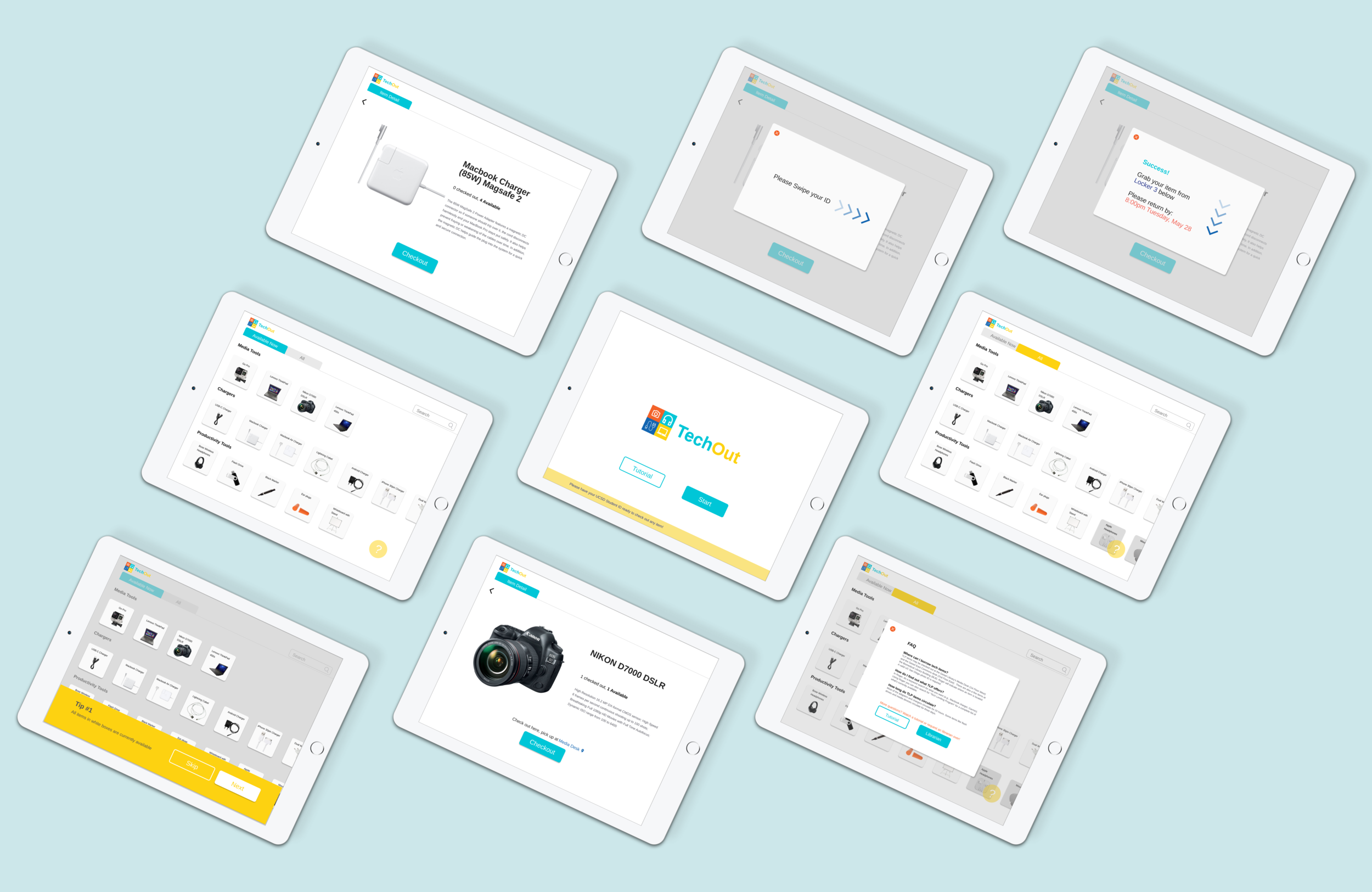
Kiosk Design
usability testing
How would users like to browse?
At this point we devised two versions of the main screen. Users could scroll through each row by clicking the arrows, or they could directly drag each row horizontally.
Version A

Version B

More Scrolling and Less Tapping, Please!

75% users choose to only click on the arrows, and did not realize the screens were designed to horizontally scrollable too. The best way quote from our users to sum up how they felt: “Tapping on the arrow is so slow! …What else can I do here? Oh wait it’s grayed out. I can’t see more? Nevermind.”
Final deliverable
Acknowledgements
We would like to acknowledge each other as well as Professor Steven Dow and our wonderful TAs & IAs for contributing to our growth and development. Special thanks to all our interviewees who have provided valuable insight and feedback to the progression of our kiosk.